
ASCA Visual Identity
ASCA is a new Defence initiative designed to fast-track capability development through tighter collaboration between Defence, industry and research. They needed a strong brand that stood apart within the Defence ecosystem and captured the energy and ambition of their mission. I created a visual identity based on the sonic boom—using sharp lines, layered movement and a bold palette to signal disruption, speed and momentum. The identity set the tone for how ASCA communicates internally and externally, and became a recognisable brand in its own right.
-
My role
Carmen Lorkin - Lead Senior Designer & Brand CreatorCreative team
Jason Perelson - Creative Director
Lydia Stevens - Strategic Communications
Andrew Gibbon - Junior DesignerDeliverables
Identity design
Brand narrative
Style guide
Print collateral
Logo design
Digital assets
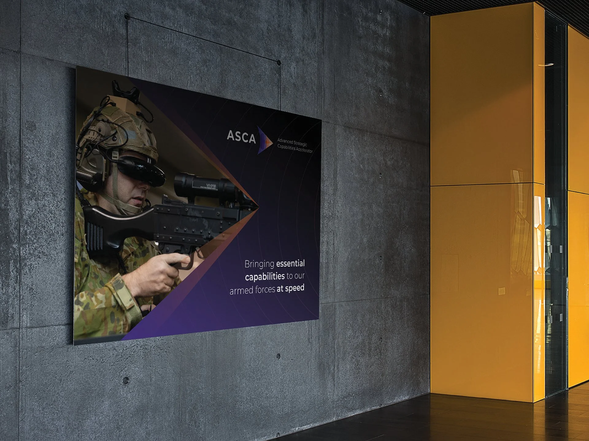
I led the creation of ASCA's identity, inspired by the concept of a sonic boom to symbolise acceleration and purposeful movement. This concept, grounded in science, represented ASCA's mission to break barriers with intent and deliver solutions at supersonic speeds. The design incorporated the Pantone colour 'Very Peri'—a periwinkle blue with violet undertones known for its association with innovation and creativity. Additionally, vibrant orange bursts were used to symbolise the partnership between ASCA, Defence, and Industry.
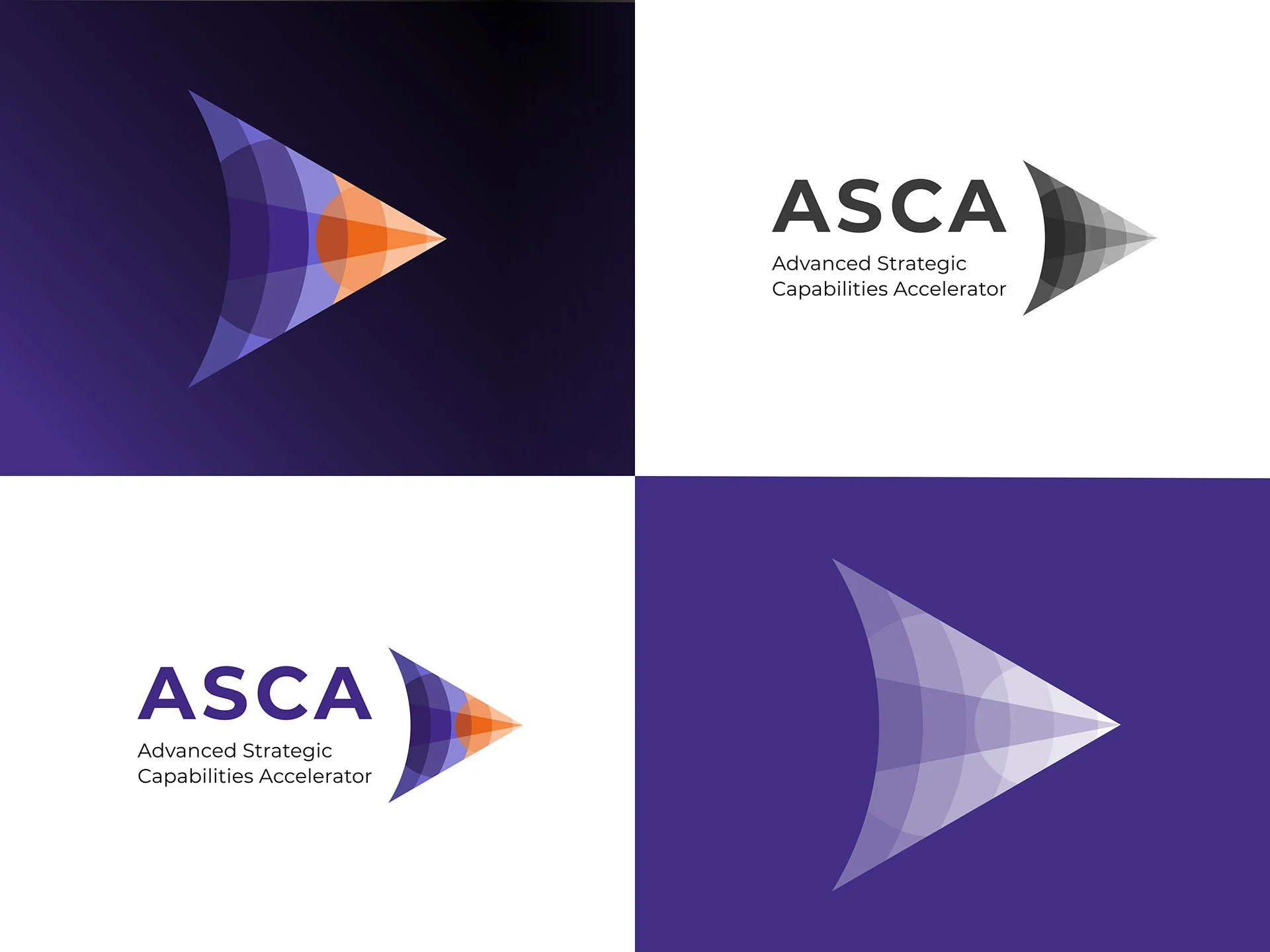
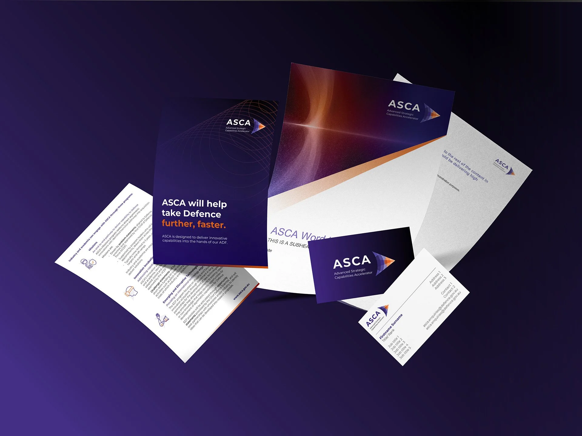
The strategic approach resulted in a dynamic and energetic identity for ASCA, fostering a culture of innovation and purposeful acceleration. The 'sonic boom' concept effectively communicated the organisation's mission and vision, resonating with stakeholders and setting a foundation for successful collaboration and rapid progress. The visual design and strategic framework established ASCA as a leader in advancing strategic capabilities within Defence.