ASCA
Taking Defence, further faster
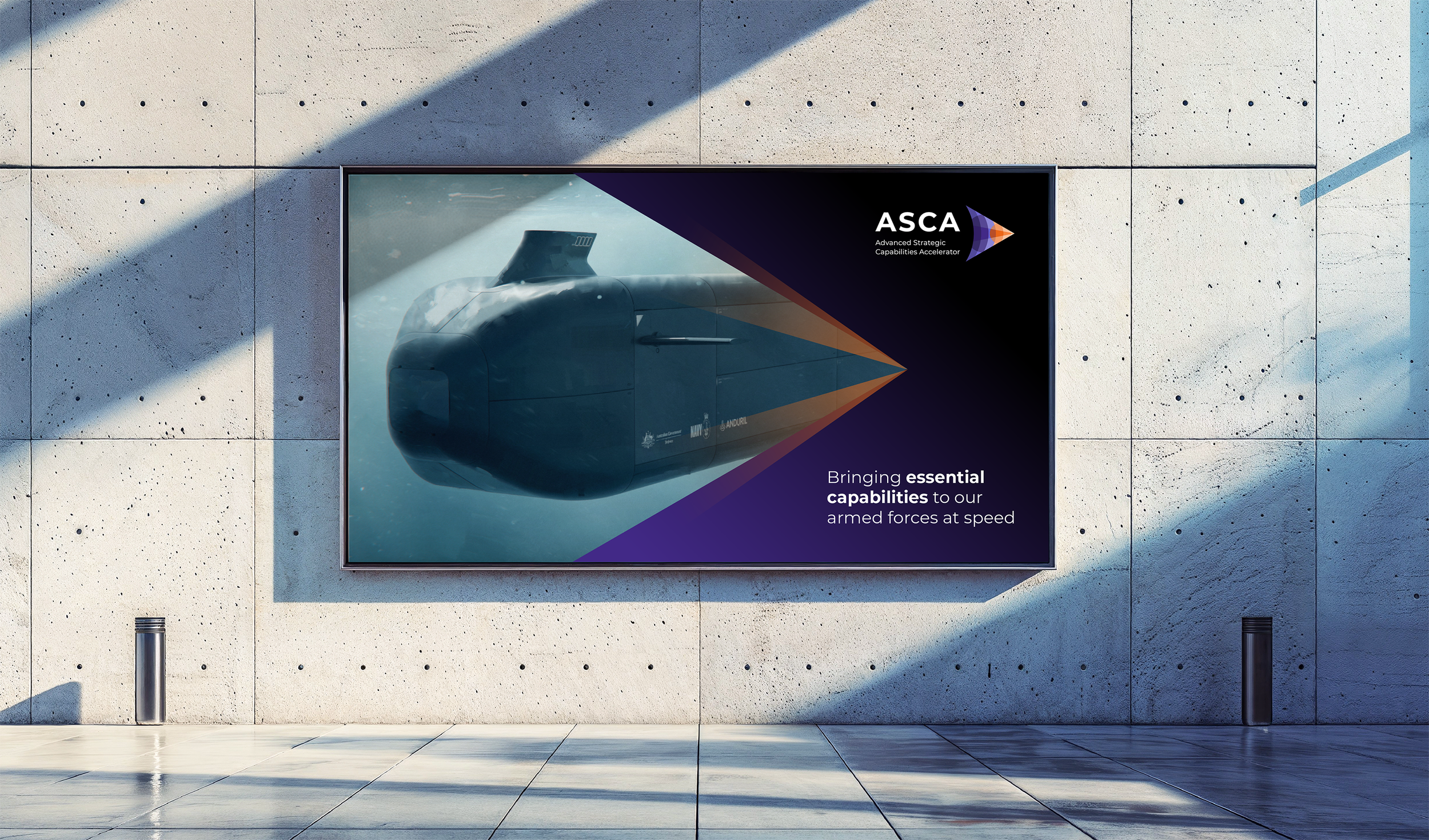
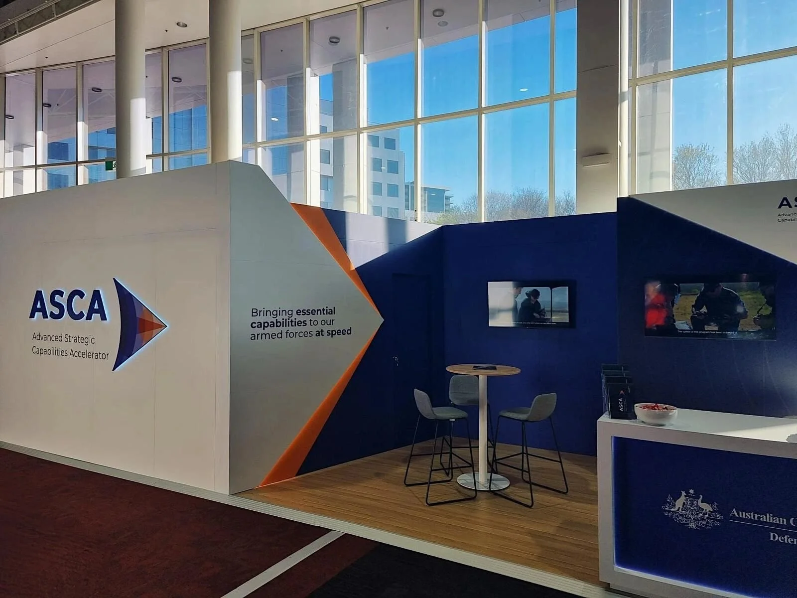
ASCA is a Defence initiative designed to fast-track capability development through collaboration between Defence, industry and research. They needed a strong brand that stood apart within the Defence ecosystem and captured the energy and ambition of their mission. I created a visual identity based on the sonic boom, using sharp lines, layered movement and a bold palette to signal disruption, speed and momentum. The identity set the tone for how ASCA communicates internally and externally and became a recognisable brand in Defence innovation.
-
Identity design
Brand narrative
Style guide
Print collateral
Logo design
Digital assets -
Carmen Lorkin – Lead Senior Designer & Brand Creator
Jason Perelson – Creative Director
Lydia Stevens – Strategic Communications
Andrew Gibbon – Junior Designer -
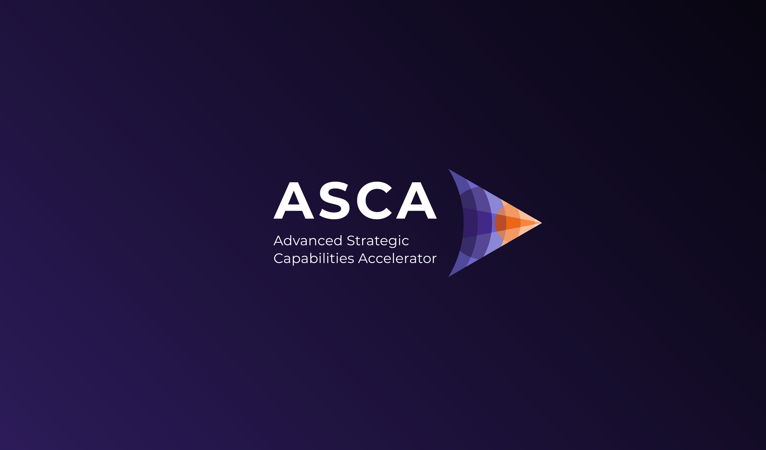
The identity is grounded in science, demonstrating acceleration through movement. The key element of ASCA is acceleration with a direct delivery purpose mindset. ASCA is not only geared to blow down barriers but break them with purpose and intent.
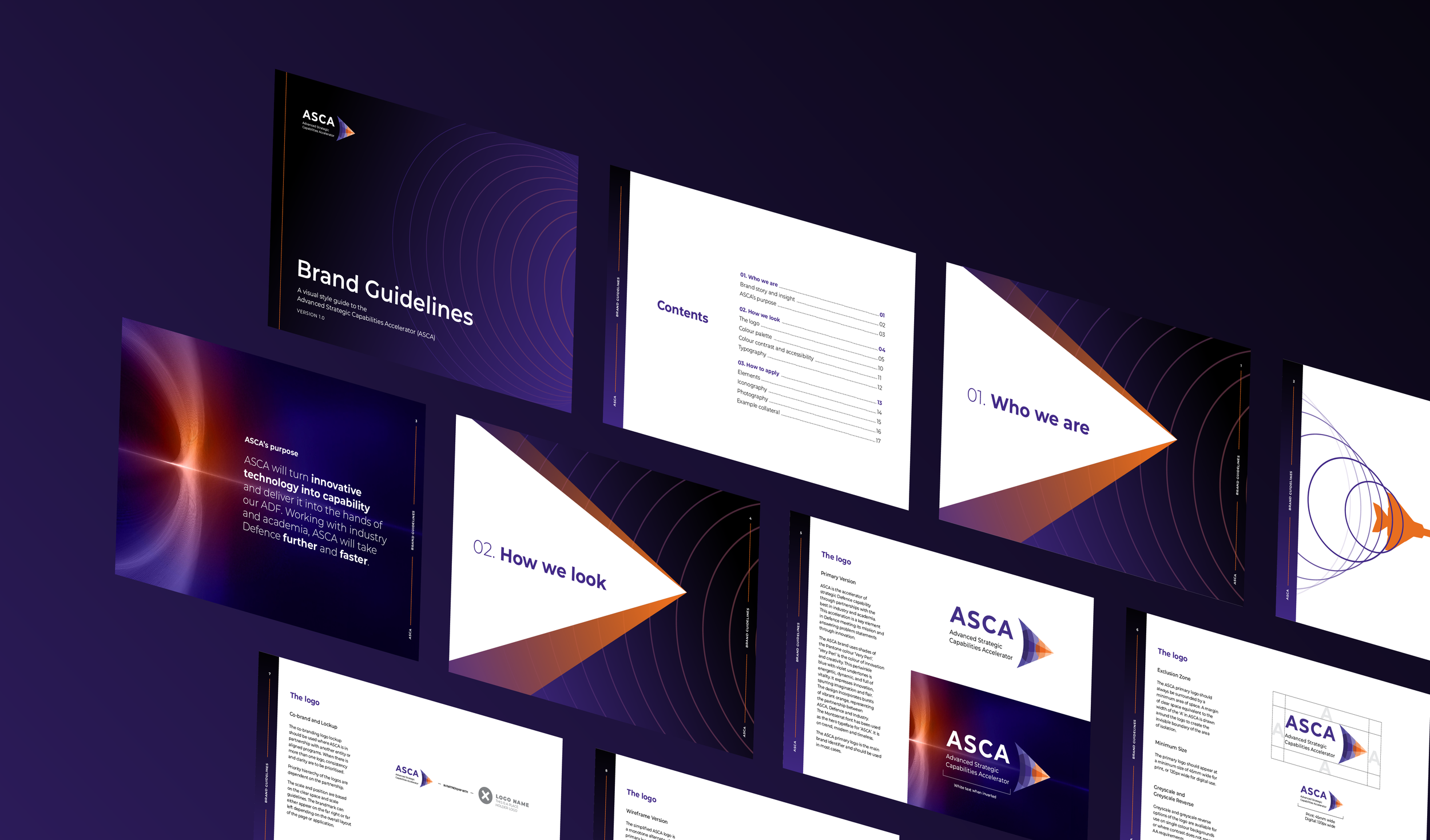

The brand uses shades of the Pantone colour ‘Very Peri’. ‘Very Peri’ was labelled the colour of innovation and creativity in 2022. This periwinkle blue with violet undertones is energetic, dynamic, and full of vitality. It expresses innovation, spurring imagination and flair. The design incorporates bursts of vibrant orange, representing the partnership between ASCA, Defence and Industry.


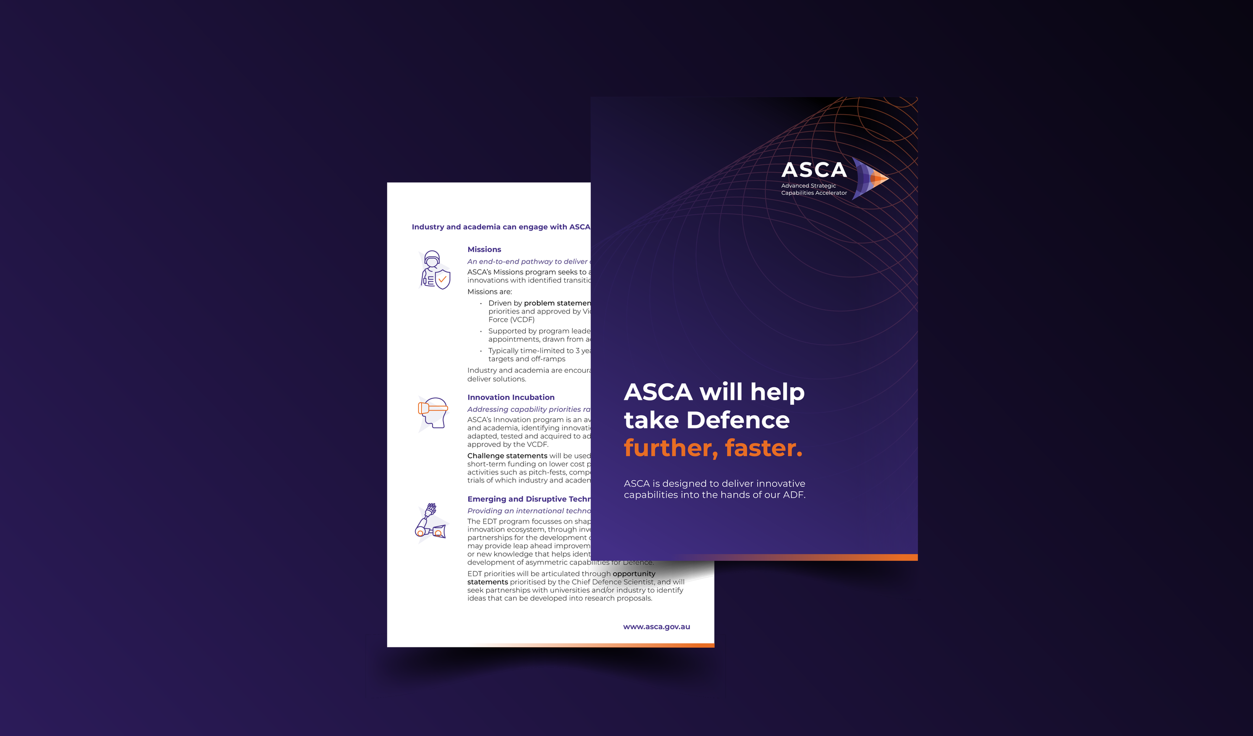
At supersonic speed, ASCA will pull in all manner of advancements, partnerships, and capabilities, rapidly pulling and propelling them forward. ASCA will take Defence further, faster.